WhatsApp Business banners play a crucial role in mobile brand promotion. These are usually the first visual elements that users see when they open your profile or chat window. A clear and appropriately sized banner helps make your page look clean and organized. When designing a WhatsApp banner, it’s important to maintain consistent branding, as inappropriate image size may result in cropping, blurring, or stretching, which can negatively affect user perception.
We have shared the methods to match your mb whatsapp blur effects with iOS 19 aesthetics. This guide will explain the correct size for WhatsApp Business banners, how to design banners correctly, and considerations for different uses.
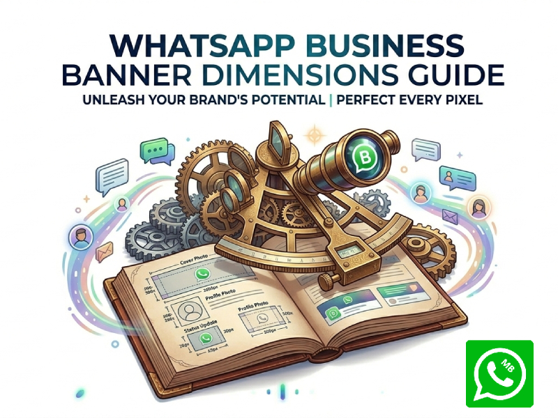
What Is a WhatsApp Business Banner
A WhatsApp Business banner is a visual image displayed on a WhatsApp profile or related area to showcase your business. It can concisely introduce the brand, helping users quickly understand the company’s business before reading any text, and when designed effectively, it often works similarly to a WhatsApp cover photo that strengthens first impressions and improves brand recognition across customer touchpoints.
In most cases, banners contain basic branding elements, such as a logo, company name, slogan, or simple visual elements related to services or products. Some businesses also use banners to highlight their main products or services or communication style in a clear and direct way.
Unlike lengthy text descriptions, banners convey information through visual elements. This makes them ideal for users who want to quickly understand information without reading too much text. A well-designed banner can make a clear first impression and make a profile look neater, more organized, and more trustworthy.
Recommended WhatsApp Business Banner Dimensions
Choosing the right banner size for WhatsApp Business will help your profile look clear and well-structured across different devices. While WhatsApp can automatically adjust images, using the correct size will ensure your design remains sharp and aligned. When setting up your profile visuals, keeping in mind the WhatsApp business cover photo size is especially important because it helps maintain consistency across desktop and mobile views, preventing important elements from being cropped or distorted.
Standard Recommended Size
The most common size for WhatsApp business banners is 1080 x 608 pixels. This size has a stable aspect ratio, which allows it to fit well with most mobile device screens. It helps avoid image stretching and maintain image balance.
Alternative Common Sizes
There are also a few other sizes that work well, depending on your design needs:
- 1200 x 628 pixels: often used for wider layouts and promotional visuals
- 1920 x 1080 pixels: suitable for high-resolution designs, but needs careful cropping
- 900 x 500 pixels: a lighter option for simpler banners
These alternatives can be useful, but the key is to keep the same general proportion so the image does not lose structure when displayed.
Aspect Ratio to Follow
The ideal aspect ratio is 1.91:1. This aspect ratio is often used for banner images because it matches most horizontal display areas. Following this proportion helps keep important elements centered and prevents edge clipping.
Content Placement Inside the Banner
Even if the size is right, the location is just as important. The central area of the banner should highlight its main message.
- Keep logos and brand names in the middle zone
- Place short text or slogans close to the center
- Avoid pushing key elements too close to the edges
This ensures that nothing important gets cut off on smaller screens.
Aspect Ratio You Should Follow
Aspect ratio is one of the most important factors when designing WhatsApp business banners. It controls how the image stretches or crops on different screens. Even if the image’s pixel dimensions are correct, an incorrect aspect ratio can still cause the design to look uneven or cropped.
The recommended aspect ratio for WhatsApp business banners is 1.91:1. This ratio is widely used because it matches the natural layout of the WhatsApp display area. It ensures that the image length is sufficient to fit the screen width, while maintaining enough height to achieve design balance.
Using this ratio, your banner is less likely to be accidentally cropped. The content remains centered and stable on most mobile devices. This is especially useful when banners contain text or logos, as their positioning is more predictable.
Safe Zone for Important Content
When designing a banner, it is not only about size. Placement also matters.
The center area of the banner is the safest place for key elements like:
- Brand name
- Logo
- Short slogan
- Contact or service message
Avoid placing text or logos too close to the edges. Some parts may get cut depending on screen size.
A simple rule is to keep all important content inside the middle 80% of the image.
Best Design Practices
Good WhatsApp business banner ads not only need to be the right size, but also need to consider the user’s visual experience, since a simple and clear layout is usually more effective than a complex and cluttered design; keeping enough white space, using readable fonts, and focusing on one key message can significantly improve engagement, especially when adapting visuals for different placements where consistency matters, such as maintaining alignment with the standard WhatsApp cover photo size guidelines to ensure the design doesn’t get cropped or distorted across devices.
Keep the design simple and focused
Banner ads should convey a core message. This could be a brand identity, core services, or a brief message. If there are too many elements, the core information will become blurred.
Use short and clear text
Text on a banner should be easy to read at a glance. A few words are enough in most cases. Long sentences tend to reduce clarity, especially on mobile screens.
Make good use of contrast
The difference between the text and the background is crucial. If the colors of the two are too similar, the information will be difficult to distinguish. Strong contrasts help designs stand out.
Place key elements in the center
Important elements such as logos, brand names, or slogans should be kept in the center of the screen. This prevents them from being cropped out for different screen sizes.
Stay consistent with brand style
Using the same colors, fonts, and visual style as other platforms helps users recognize your brand more quickly. Maintaining consistency can establish a more stable visual identity.
Banner Size for Different Devices
WhatsApp is mostly used on mobile phones, but the display can vary slightly depending on device size.
- Small phones may crop edges more tightly
- Larger phones show more of the side area
- Tablets may display the banner more fully
Because of this, it is better to design with extra margin space around the edges.
FAQs
1. Can I use a square image for my banner?
Yes, but that’s not the ideal choice. Square images may be cropped or resized, which can affect the final design. A wide rectangle format works better.
2. What file format works best for banners?
PNG is usually the best choice because it keeps text and logos sharp and clear. JPG is also well-suited for image designs with less detail.
3. Why does my banner look cropped on some phones?
Banner ads display slightly differently on different screen sizes. If important elements are placed too close to the edge of the screen, they may be cropped out.
4. How much text should I put on the banner?
Keep the text concise. A short phrase or slogan is enough. Too much text can make a design difficult to read on a small screen.
5. How often should I change my banner?
There are no fixed rules. Many businesses update it when launching new promotional campaigns, brand updates, or seasonal events.
Final Thoughts
Although small in size, WhatsApp Business banners are crucial to brand image. Using the correct dimensions, such as 1080 x 608 pixels, ensures your design presents a clear and professional visual effect on a variety of devices. A clean layout, good contrast, and appropriate spacing can make a significant difference.
A well-designed banner helps users understand your business more quickly and makes your profile look neater and more organized.